
AUG 2024
GOODREADS REDESIGN
33% Faster Discovery & a +23 SUS improvement
FIND YOUR NEW FAVORITE BOOK
PROJECT TYPE
REDESIGN
SCOPE
2 DAYS
Services
UI REDESIGN
TOOLS
figma
goodnotes

Fixing the most relatable reader problem:
“I want to track my reading… but this app is fighting me.”
a frustrated user
Results that mattered
+23
ADDITIONAL SUS POINTS
33%
faster task completion
Streamlined flows that make tracking feel effortless, and not like a New Year’s resolution you abandon in a week
A GLIMPSE
overview
As a reader, I knew exactly why this redesign mattered. Goodreads promises to help you find your next book and track your reading. But the experience feels stuck in the 2000s with all the cluttered screens, outdated UI, and no clear path to basic tasks.
It does have strengths: huge book database, yearly challenges, even fanfics.
But the overall experience pushes readers away instead of keeping them consistent. This clarity helped me define the exact problem, and the goal for the redesign.
THE PROBLEM
Goodreads helps millions of readers, but its outdated and cluttered interface makes basic actions like finding a book or updating reading progress, way harder than they need to be.
As a result, readers feel overwhelmed, lose consistency, and eventually stop using the app.
THE GOAL
The goal of this redesign was to bring clarity and ease back into the reading journey. I wanted to create an experience where readers could discover books effortlessly, update their progress without thinking twice, and stay consistently engaged, because a reading app should support the habit, not make it harder.
My process and strategy
The approach
My goal was to understand why Goodreads felt difficult to use and how readers naturally expected the app to behave. Instead of redesigning everything at once, I focused on the core reading flows that directly impact engagement and retention.
heuristic evaluation
I conducted a quick heuristic evaluation to identify usability breaks. The key findings from the evaluation are:
Consistency and standards
Recognition over recall
User control and freedom
Visual hierarchy and clarity
This helped me map out which UI patterns were confusing, which actions were hidden, and where the app created unnecessary friction.
You can find the full heuristic evaluation here.
setting priorities
With a tight two-day timeline, I defined three clear priorities:
Make tracking easy and instantly accessible
Bring primary actions to the surface
Reduce clutter and create a cleaner, calmer experience
Everything outside this core flow, especially social and community features were intentionally left out of scope.
structuring the Experience
I approached the redesign by mapping user flows instead of isolated screens.
The focus was on simplifying the loop: discover → track → update
To support this, I reorganized the information hierarchy so that users first see:
what they're currently reading
their reading challenge status
relevant recommendations based on past activity
This creates a predictable, intuitive flow that reduces cognitive load.
the MVP
For the MVP, I focused on improving inconsistent UI elements, reducing clutter, surfacing primary actions for a smooth user experience.
the focus
A streamlined, reader-first foundation that fixes the core experience without touching social or community features.
This MVP includes improvements across the Home, Reading Challenge, My Books, Profile, and Search screens, which are the areas readers use the most.
WHY THESE
These screens support the essential loop of the user flow. If these flows aren’t smooth, the entire app feels frustrating, even with a modern UI.
what i improved
Primary actions surfaced immediately
Clear entry points for primary actions
Reading challenge visible at all times
Clean, consistent, modern UI style
CLEAR HIERARCHY TO REDUCE MENTAL LOAD
REDUCED taps to complete actions
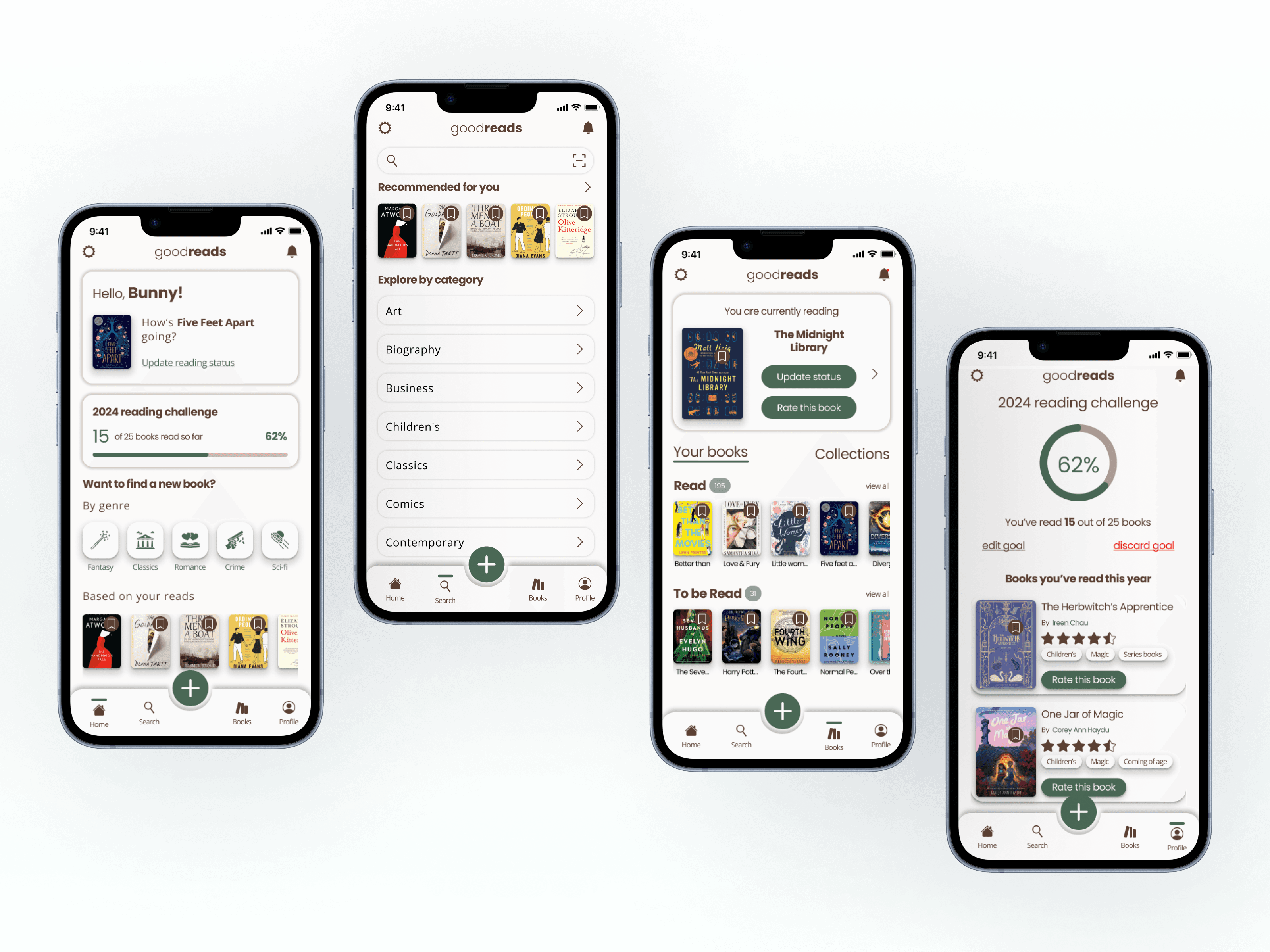
HOW THE MVP LOOKS
hOME SCREEN


SEARCH

The new home page gives users immediate access to what matters most, like current reads, reading challenges, and personalized book suggestions.
Book details screen

I emphasized clarity and ease of interaction. The redesigned page features a large book cover, key details (author, rating), and relevant tags, with sections for an overview and user reviews.
mY PROFILE
reading challenge

The revamped page features a donut chart displaying progress towards the reading goal. Below, a list of books read this year is shown.

This page displays all of users’ current reads, with quick options to update status or leave a review. The page also neatly organizes books into "To Be Read" and "Read" sections, along with saved collections.
FINAL PROTOTYPES
HOME

SEARCH

my books

MY PROFILE

READING CHALLENGE

BOOK DETAILS

lessons learnt
simplicity enhances usability
Stripping away clutter and social distractions helps users focus on their primary goals like discovering and tracking books, resulting in improved task success and satisfaction.
Consistency is Crucial
Maintaining uniform UI elements like buttons, typography, and spacing reduces cognitive load, making interaction flows smoother and more intuitive for varying user types.
User-Centric Design Requires Validation
Real user testing uncovered nuanced navigation issues and confirmed the effectiveness of design choices, emphasizing iterative prototyping and feedback loops.
Visual Tone Impacts Emotional Connection
A warm, cozy color palette and balanced whitespace can strengthen users’ emotional engagement, reinforcing the platform’s identity as a reader-first space.
let's collaborate!
Let’s design something that makes people feel seen.